


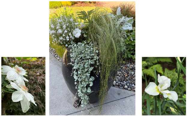
Pantone’s Color of the Year, Cloud Dancer, really said, “I’m not just a January thing—I’m a lifestyle,” and honestly, it keeps showing up like that one friend who’s always overdressed but somehow makes the whole group look better. Month after month, it sneaks into container gardens, pairing effortlessly with cool grey hues that pop against those metallic colored AW Pottery pieces.
Then there’s the white iris, which basically lounges in the shade as nature’s visual air-conditioning unit. It revels in the afternoon shade like it’s clocking in for a chill shift, cooling down the hot summer day with the same vibe as someone who shows up to brunch with an iced matcha and emotional stability. Paired with Pantone’s palette, it’s a whole mood—calm, elegant, and slightly smug about how photogenic it is.
And don’t get me started on the dramatic combo of billowing white clematis and the Japanese maple leaves that make those stamen go POW! It is fireworks in the garden that we want and doesn’t rattle our nerves. It’s the kind of detail you only notice when you slow down, breathe, and actually look at your landscape instead of doom-scrolling. This whole exercise—slowing down, noticing details, celebrating simplicity—feels very Gen Z-core: intentional, a little chaotic, but deeply wholesome. A garden can serve quiet luxury in the form of a simple color.
Garden Friendly Highlights
- Pantone vibes — the color that refuses to be seasonal and keeps showing up like a loyal bestie.
- White iris energy — cooling the day like a botanical emotional support beverage.
- Clematis drama — billowing petals + POW-level stamen = garden glam.
- Japanese maple details — subtle, spicy, and always camera-ready.
- Mindful landscaping — noticing the small things = free the dopamine dump.


